We’ve still got more than 2 months left in 2025, but nearly ALL of the 2026 Color of the Year announcements we track are already in! Check out where thing stand so far below…
The annual Color of the Year announcements are one of our favorite traditions to follow (and predict, with varying degrees of sucess). Each year, a lot of the largest paint manufacturers select a hue and/or palette they believe “captures” and/or “forecasts” design trends. Some are bold. Some are boring. Some are straight-up bonkers (who remembers the color we affectionately dubbed “hot dog”?). So we’ll continue to update this post as the 2026 COTYs are announced over the next six months. And be sure to check out our 2024 and 2025 round-ups as a recap!
Like we did last year, we’re also showing you each company’s picks over the last few years right here in this post, because it’s a fun way to see how styles shift and brands swing from year-to-year. And you can find our predictions at the bottom!
What is the 2026 Color of the Year?
There isn’t one single “color of the year.” Instead, several companies like Benjamin Moore, Sherwin-Williams, and Pantone, declare their own individual color. There are different methods for how each brand makes their choice, but the goal (besides marketing) is to comment on what they’re seeing or predicting in the design world. Sometimes they also use it to represent larger trends or consumer moods like feeling hope, a returning to nature, or embracing rest.
What Were Last Year’s Colors?
Below are our recaps of every Color of the Year for both 2024 and 2025 – and you can click those two years for an in-depth look at previous selections. The 2025 colors that were chosen were dominated by moody browns, purples, and mauves. It was actually surprisingly consistent across most of the brands! Especially when you compare them to 2024, where we saw a lot more variety (some warm, some cool, some light, some dark).
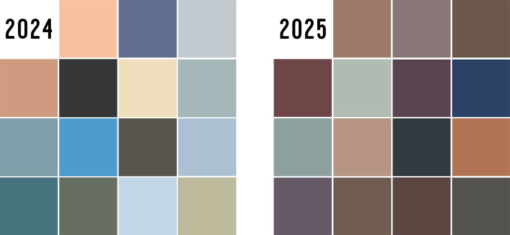
It will be interesting to see if any brands richocet back to lighter, brighter, or cheerier colors in 2026 since we’d generally describe last year’s as… very brown. Will we see a lot of commonalities across brands again this year? Or will the different companies make bold choices to distinguish themselves from the pack?
Every 2026 Color of the Year
So far we have seen Color of the Year announcements from 11 of the 15 brands we track each year. We expect to see Benjamin Moore and others in the next few weeks, but last year we didn’t get the final announcement until January.
- Benjamin Moore: Silhouette
- Sherwin-Williams: Universal Khaki
- Behr: Hidden Gem
- HGTV Home by Sherwin-Williams: Universal Khaki
- Glidden: Warm Mahogany
- Valpsar: Warm Eucalyptus
- Dunn-Edwards: Midnight Garden
- Dutch Boy: Melodious Ivory
- Krylon: Coffee Bean
- Minwax: Special Walnut
- Graham & Brown: Divine Damson
- C2 Paint: Epernay
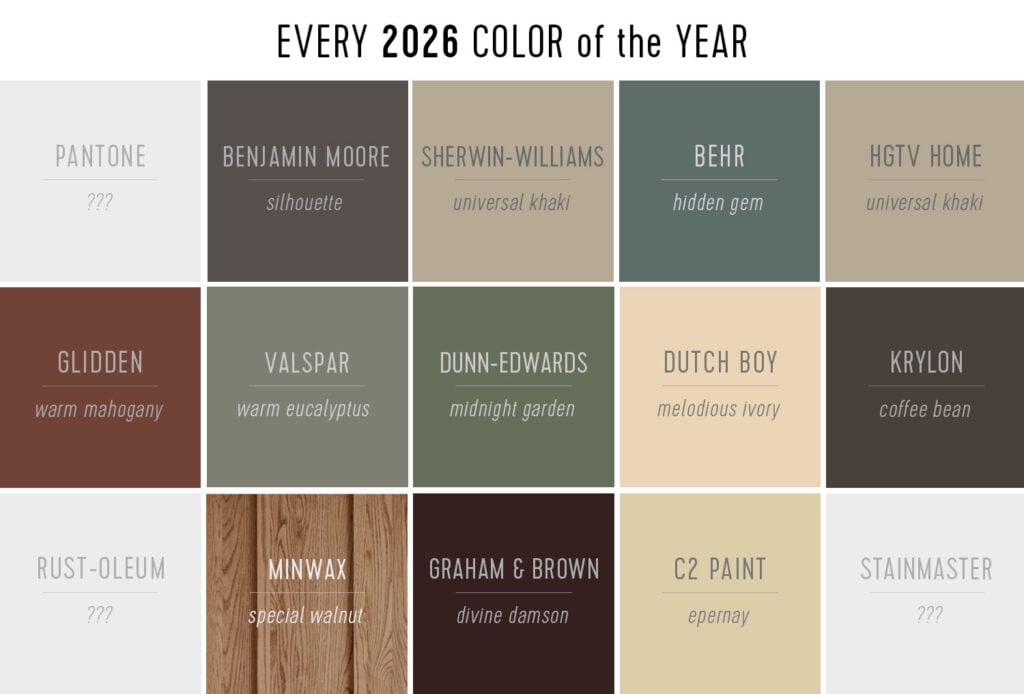
Here’s a closer look at each color we know so far.
Benjamin Moore’s 2026 Color of the Year
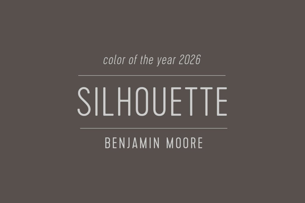
Benjamin Moore selected Silhouette (AF-655) as their 2026 Color of the Year. They describe it as a “burnt umber with delicate notes of charcoal” and was chosen to lead their 2026 Color Trends, dubbed “Refined Elegance.” Announced in October 2025, it fits a growing trend of brands using words like elegeant and timeless in this year’s selections. We’ve used Silhouette several times as a trusty alternative to black, since it’s a slightly lighter and warmer.
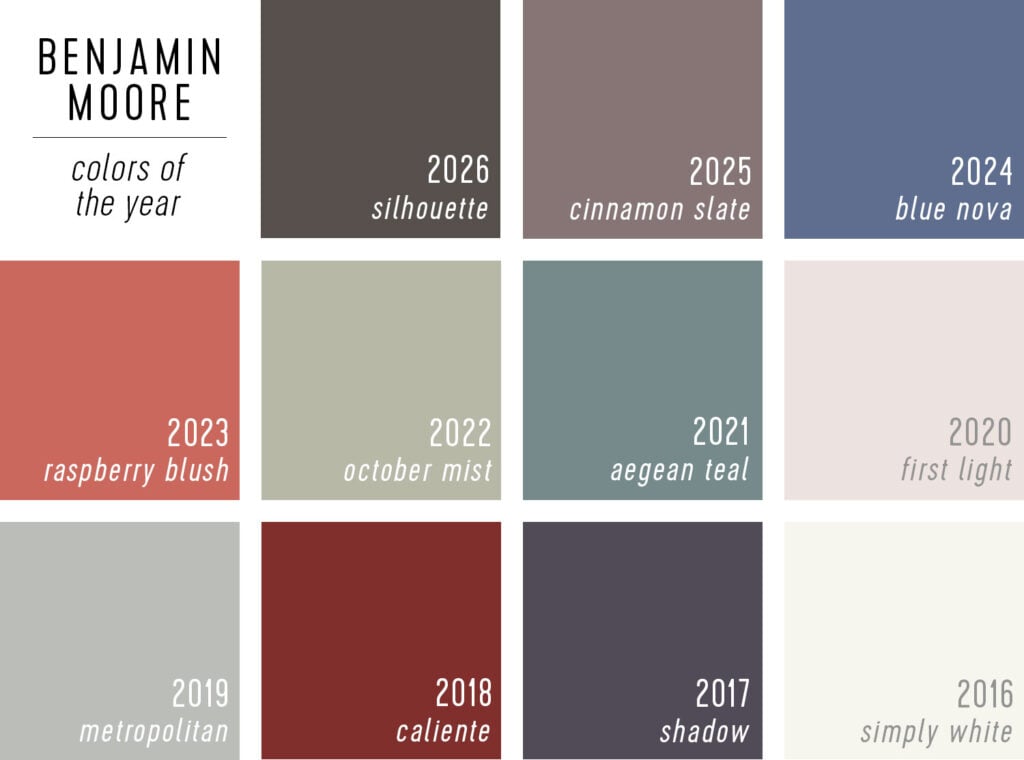
When we look at the last 10 years of Benjamin Moore’s selections, this is least colorful tone since 2019’s Metropolitan – which matches the trend we’ve been seeing away from bright colors and to deep neutrals.
Sherwin-Williams’ 2026 Color of the Year
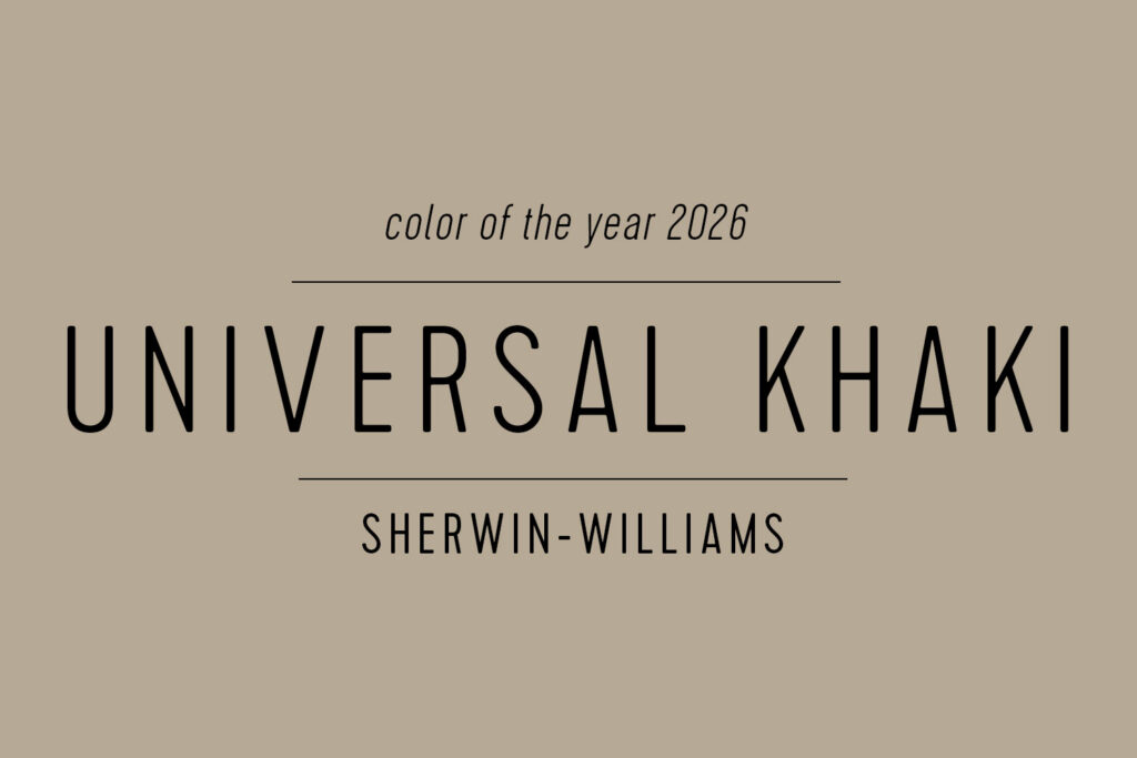
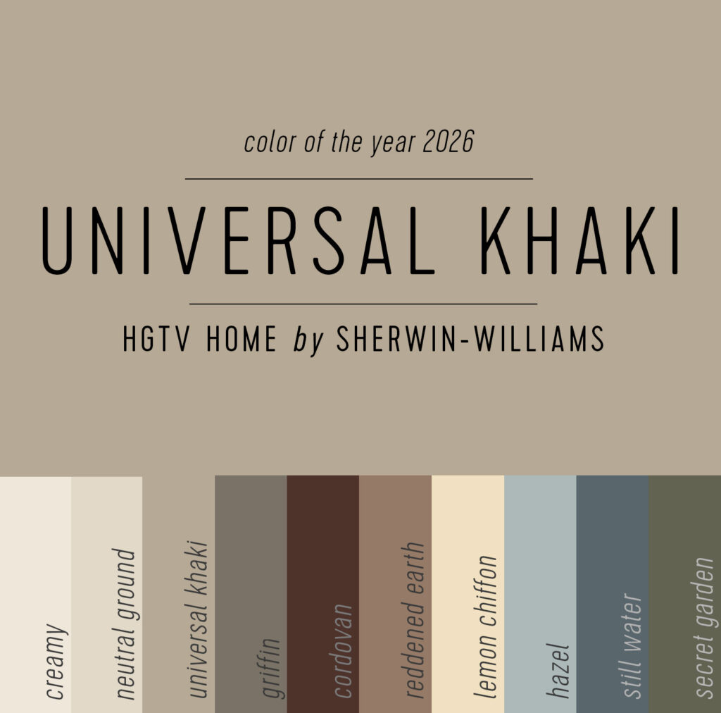
This year, Sherwin-Williams’ declared Universal Khaki their 2026 Color of the Year. This “warm, earthy neutral” spearheads a trend forecast they’ve dubbed “Tailored & Timeless” which uses descriptors like classic, simple, and elegant. It’s the 3rd creamy tan tone announced for 2026 (4th if you count HGTV Home by Sherwin-Williams doubling down on this same swatch).
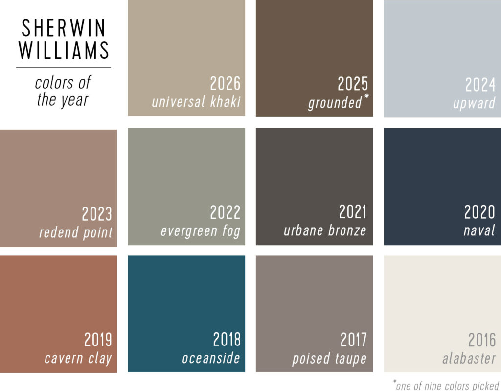
As you can see from Sherwin-Williams’ past picks, they are big fans of muted, timeless hues (apart from a colorful detour from 2018 – 2020). And like this year’s selection most tend to be warm with red or yellow undertones.
Behr’s 2026 Color of the Year
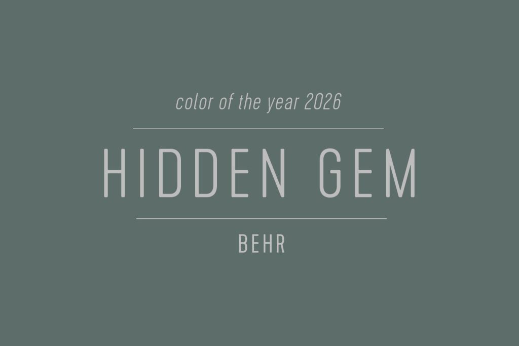
Behr kept things dark & rich for the third consective year with their 2026 Color of the Year pick: Hidden Gem. Described as a “smokey jade with an air of mystery,” it’s bold & colorful but still desaturated enough to make it suitable as a wall color. It’s also reminds us of one of our favorite accent colors from around 15 years ago (this one).
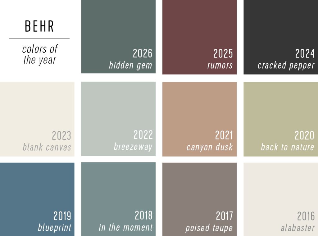
As you can see, the last 3 years have been a notable shift from the lighter and breezier colors Behr used to select. We’re not too surprised, given the prevalence of deep, moody colors lately (and full room color-drenching, which means painting the trim/molding as well as built-ins or cabinets the same rich hue).
HGTV Home by Sherwin-Williams 2026 Color of the Year
No, you’re not experiencing deja vu! This is the same swatch shown above for Sherwin-Williams. Unlike previous years, HGTV Home opted not to declare their own Color of the Year and instead piggybacked on their parent brands’ choice: Universal Khaki.
HGTV Home did, however, announce a 2026 Color Collection of the Year called Honest Essentials, which includes Universal Khaki. These 10 swatches represent a series of color trend forecasts like Timeless Neutrals, Conscious Colors, and Neutrals & Nature – all pointing to subtle contrasts and organic, environmental hues.
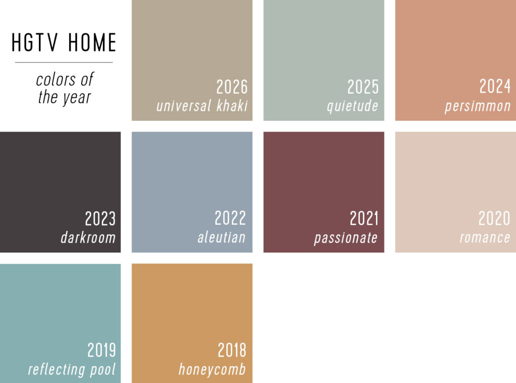
While such a neutral choice is expected from their parent brand, Universal Khaki is a bit of a departure for HGTV Home by Sherwin-Williams. Like their magazine covers, HGTV tends towards bolder, punchier colors – which is always fun to see. So personally we hope they choose their own Color of the Year for 2027!
Glidden’s 2026 Color of the Year
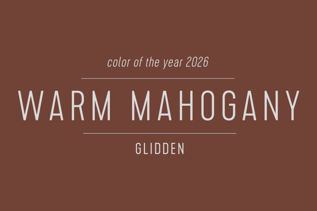
Glidden announced Warm Mahogany as their 2026 Color of the Year. It’s described as a “rich, grounded red” that anchors an annual color trends collection that’s all about “rest, connection, and creativity.” This echoes some of the same language used in Valspar’s announcement (see below) which, ironically, is another color with “warm” in the name. However, this reddish tone fits more closely with the overall trend we saw in 2025 COTY announcements.
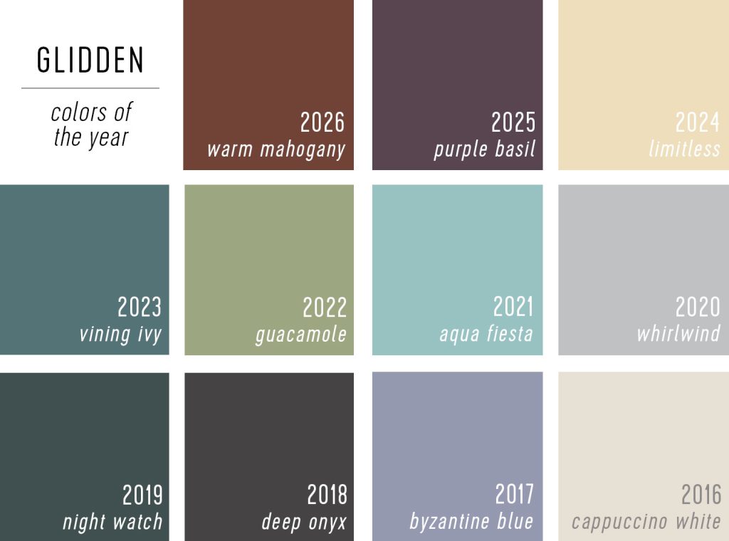
Interestingly, Warm Mahogany is not too far off from last year’s selection, Purple Basil. Both are dark, saturated, warm tones that are a noticable contrast from previous years.
Valspar’s 2026 Color of the Year
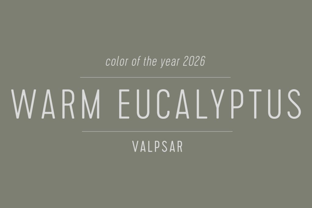
Valspar’s 2026 selection, Warm Eucalyptus, is muted, earthy gray-green that the paint company describes as “restful to the eye” and therefore “restful to the soul.” Their announcement talks a lot about redefining how we think about neutral colors, and they say that neutrals aren’t colorless, they’re just inviting, calming, and grounding colors that feeling “restorative.”
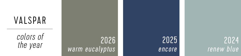
This is Valspar’s third year of picking a single COTY (prior to 2024, they announced a mutli-color collection). It’s definitely a popular color that has been trending for a while that, like their picks before it, is a safe choice that’s pretty easy to use in a lot of applications (without being white/beige/tan). It will be interesting if we see them swing back to traditional colorless “neutrals” like grays, creams, or charcoals in the future.
Dunn-Edwards Color of the Year 2026
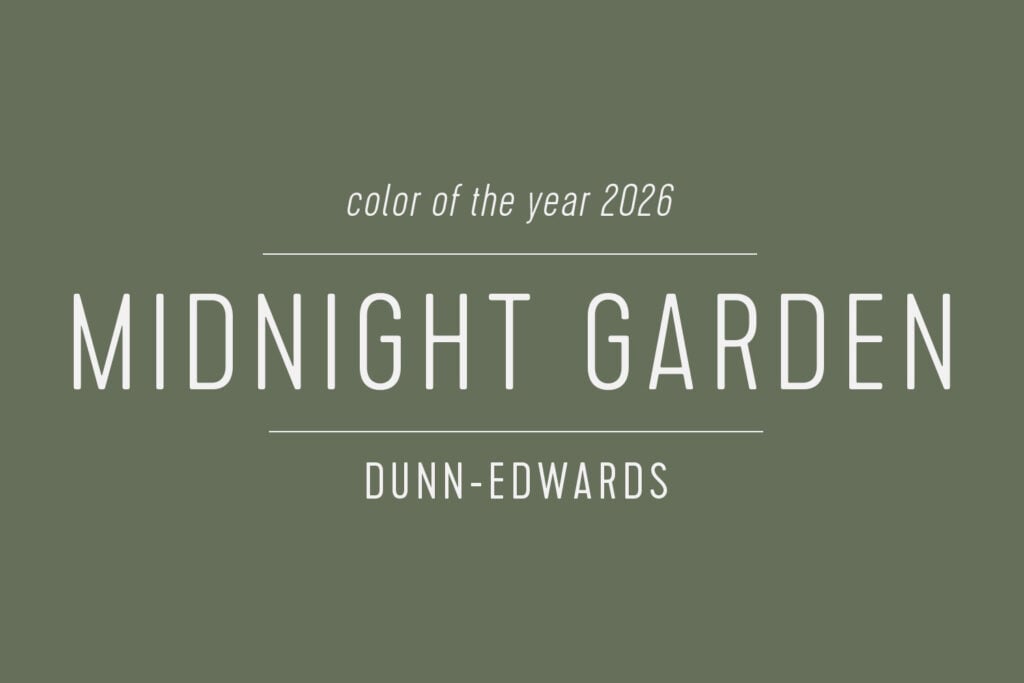
Dunn-Edwards selected Midnight Garden as their 2026 COTY. Their selection of this “deep, muted green” echoes a lot of the themes we’ve been hearing this year. They describe it as “timeless color” with “earthy undertones” that embodies a “quiet elegance” of a lush garden in the moonlight. It’s one of the more colorful picks of 2026 and the only green we’ve seen so far.
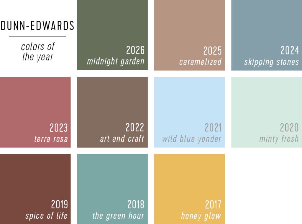
As you can see from Dunn-Edwards’ decade of picking Colors of the Year – they tend to go for bright, saturated hues. So Midnight Garden might be considered one of their more “neutral” selections, a trend we’ve seen with others this year (like Benjamin Moore).
Dutch Boy’s Color of the Year 2026
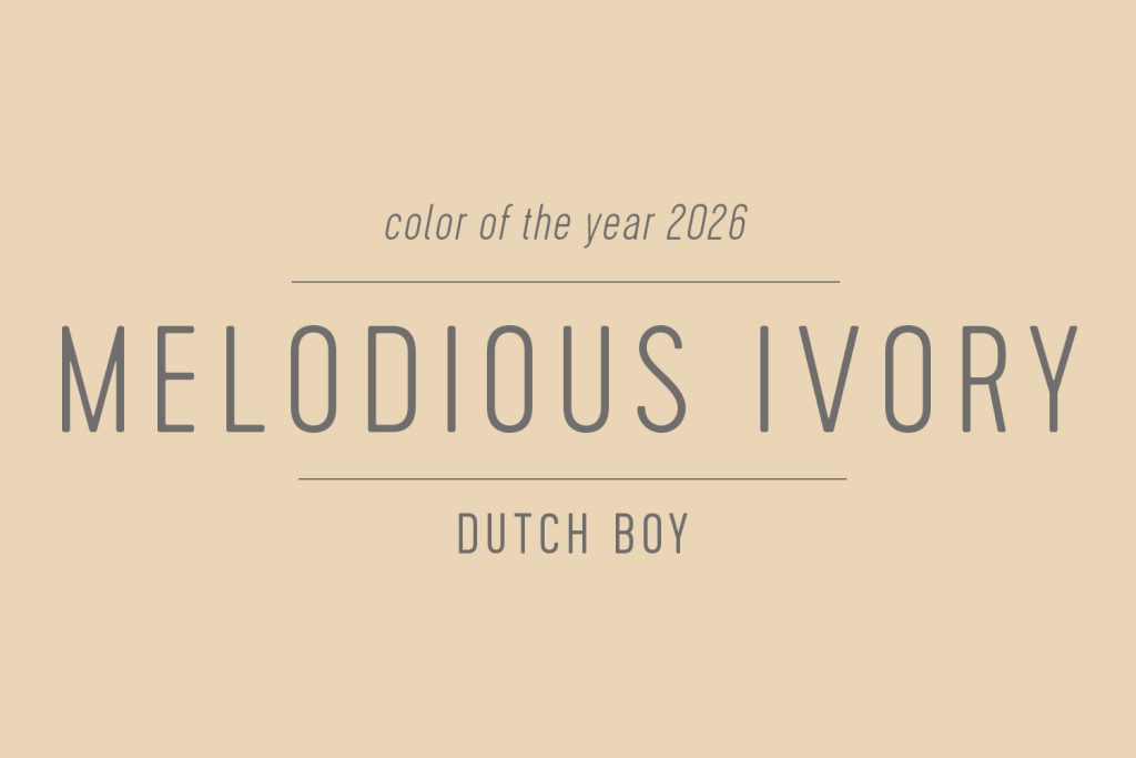
The 2026 Color of the Year from Dutch Boy (available at Menard’s) is Melodious Ivory. This warm cream color was selected for it’s “nostaglic, elevated vibe” and it’s ability to layer with bolder, accent colors. The imagery used in Dutch Boy’s announcement showcases a sort of rustic, almost modern farmhouse look.
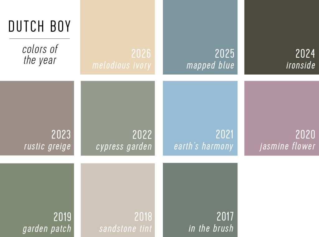
Melodious Ivory fits well with Dutch Boy’s past selections, which all tend to be quiet, comfortable colors that tend towards warm neutrals (apart from 2024’s Ironside). And if you scroll to the bottom, you’ll see this “creamy white” isn’t too far off from one of my predictions for the year!
Krylon’s 2026 Color of the Year
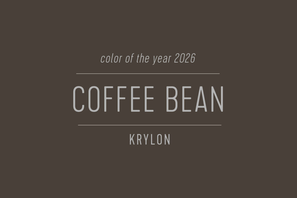
Krylon selected Coffee Bean as their 2026 Color of the Year. They don’t offer much explanation in their announcement, but like many other picks this year, they say it was inspired by natural elements. Spray paints brands like Krylon have a more limited, less nuanced palette of colors to choose from compared to traditional paint companies, so it’s always fascinating to see what they select.
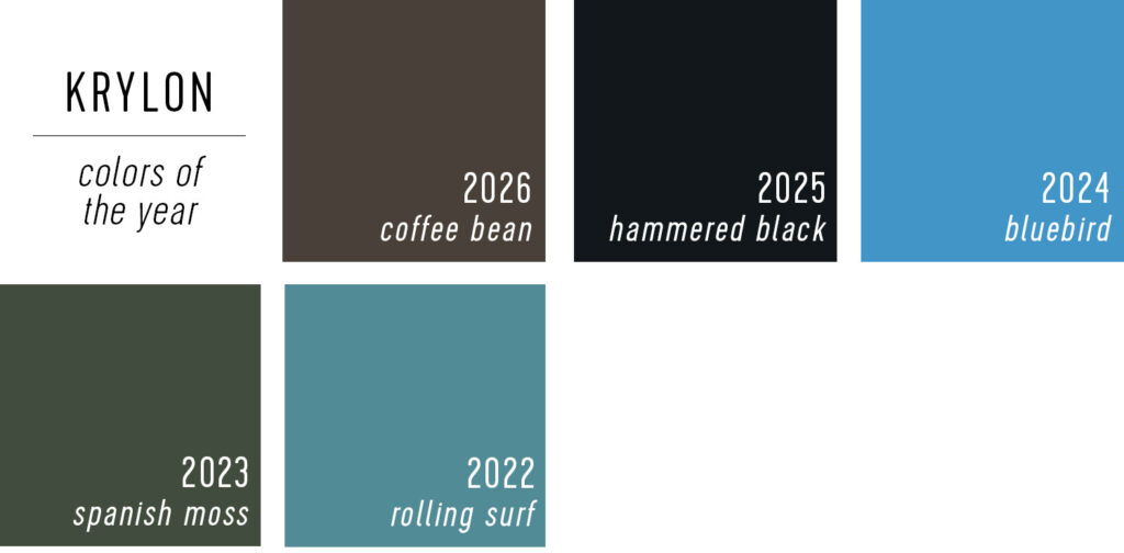
As you can see from previous Krylon’s previous COTY picks, they tend towards bold, deeply saturated hues. It’s interesting they have chosen two dark neutrals back-to-back, with Coffee Bean following last years Black.
Minwax’s 2026 Color of the Year
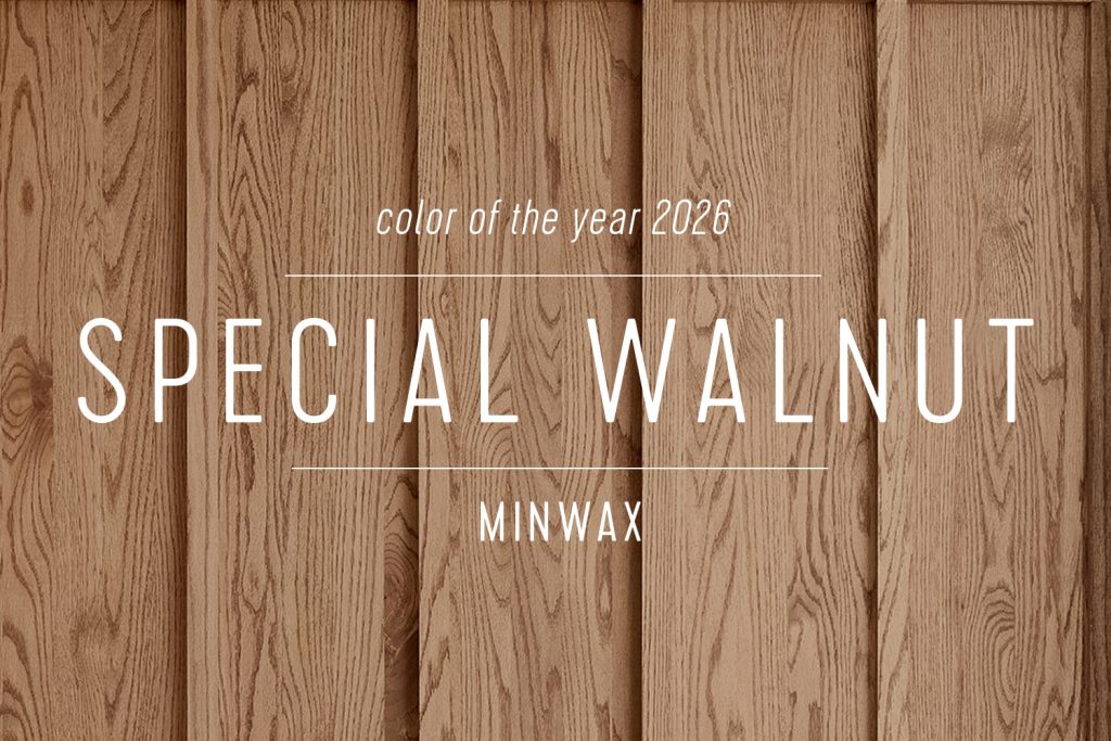
The wood stain brand Minwax gets in on the COTY action every year, and this year selected Special Walnut. This is often our go-to stain color (we even refinished the duplex floors in it!) so we fully support this selection. Minwax says they’re reflecting a trend towards rustic wood tones and even “wood drenching” spaces across ceilings and walls. They use the word “grounding” that both Glidden & Valspar referenced also (FYI Minwax & Valspar are both owned by Sherwin-Williams).
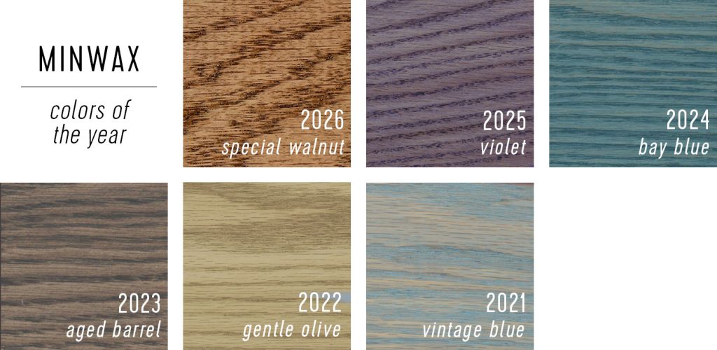
And when we look back at Minwax’s 6 Color of the Year selections, Special Walnut is really the first time they’ve chosen a classic, medium wood tone.
Graham & Brown’s 2026 Color of the Year
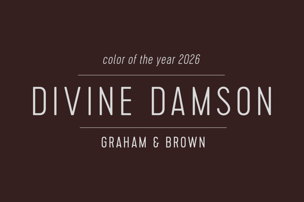
Divine Damson is Graham & Brown’s pick for 2026 Color of the Year. I’ll admit I had to Google what a damson is! Each year they pick a paint color to complement the colorways of their wallpaper Design of the Year. This year’s deep, saturated purple is described as timeless and versitle. It was selected for how it evokes luxury, elegance, and sophistication.
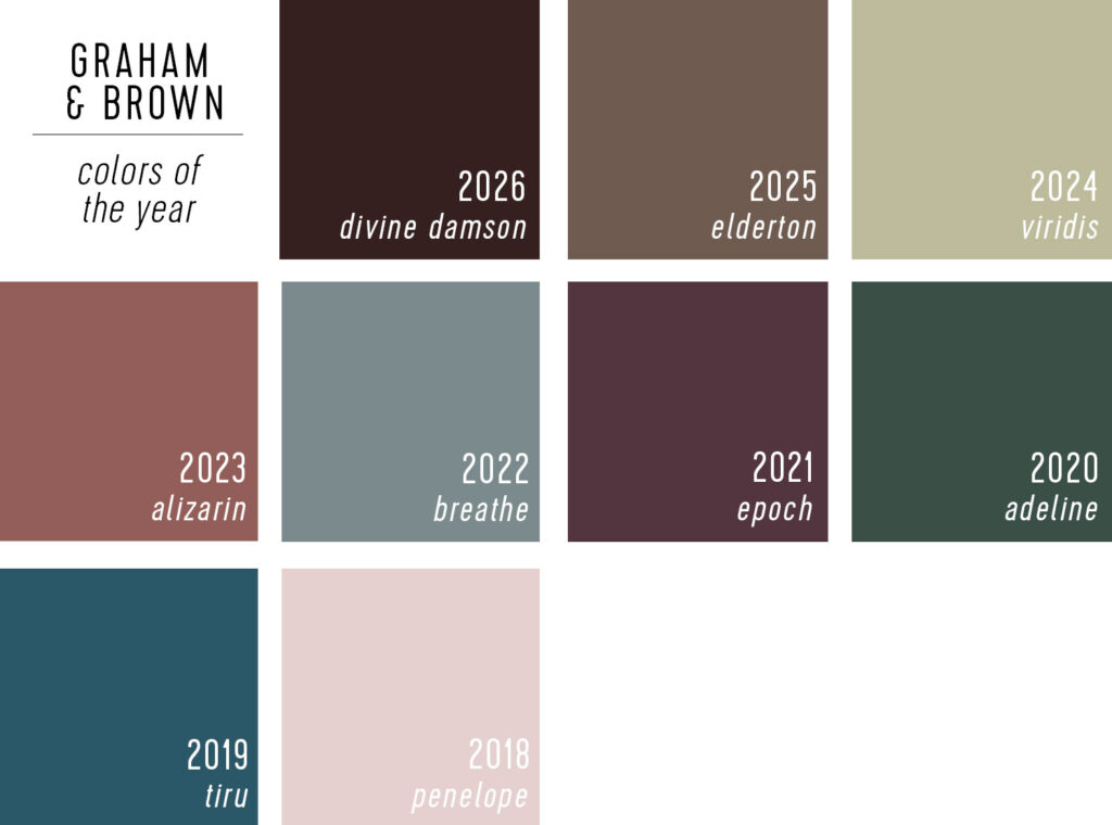
As you can see from Graham & Brown’s recent Color of the Year selections, they aim for sophisticated and elegant colors (again, picked to complement their high end wallpapers). This year’s Divine Damson almost looks like they doubled down on last year’s Elderton, picking an even darker, more saturated hue!
C2 Paint’s 2026 Color of the Year
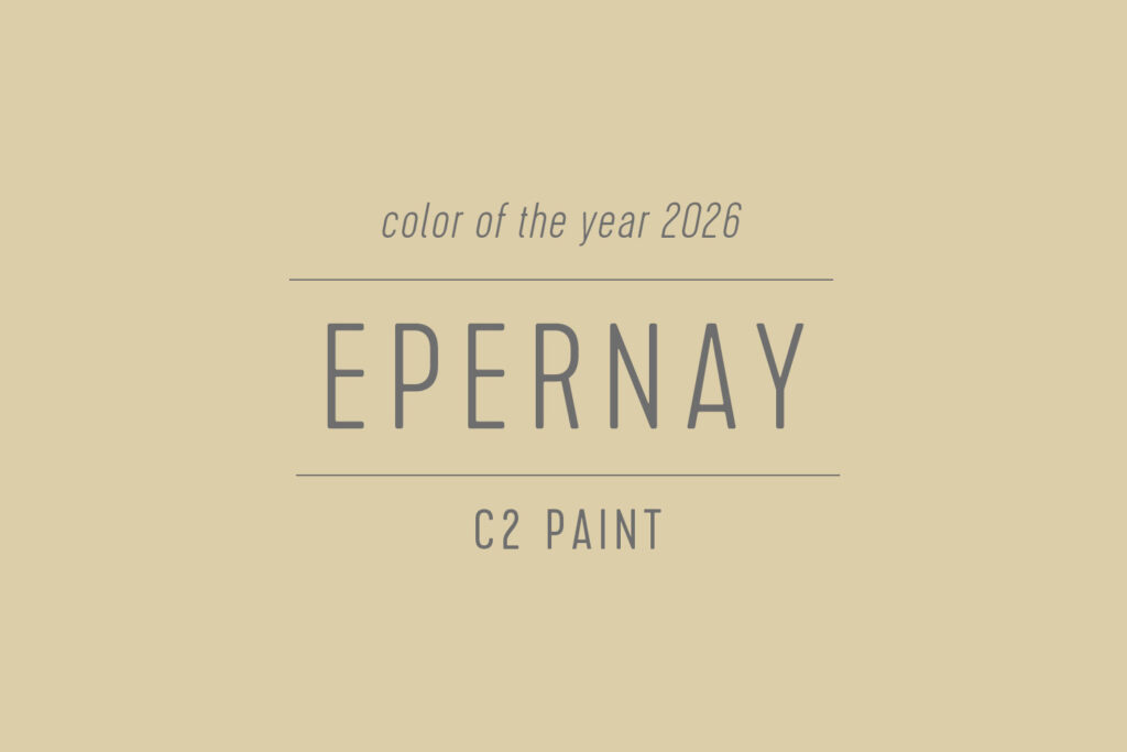
C2 Paints selected Epernay for their 2026 Color of the Year. The name references a French town known for champagne, and in their announcement, C2 says it embodies a return to “craft, artistry, and nature” seen in European interiors. The color is a soft yellow, or “earthy ochre” in their words, and is part of a trending palette they’ve dubbed En Terre (another earth reference) . And although its much more muted than most other selections this year, it’s the third color to be described as “grounded.”
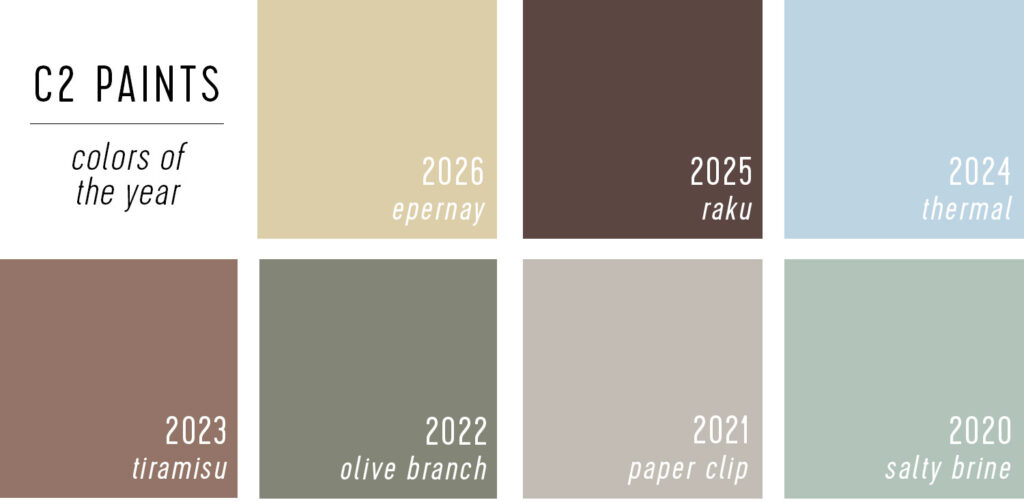
Looking back at C2 Paints’ previous Colof of the Year selections, they do tend towards softer, gentler hues – with the exception of last year’s Raku.
Our 2026 Color of the Year Predictions
In addition to tracking these announcements, we like to make our own guesses. You can see how we did with our predictions last year right here in this recap. Here are our 2026 predictions, which we made on August 1, 2025 on Instagram stories (that’s typically where you can find them each year).
Sherry’s Guesses
- A taupey-purple
- Emerald green
- Fire engine red
John’s Guesses
- A creamy white
- Rich navy
- Pink-ish terra cotta
While we haven’t nailed anything so far, we’ve been close on a couple . Dutch Boy’s Melodious Ivory and C2 Paint’s Epernay are a warmer and more saturated than the “creamy white” I imagined, but both are pretty darn close. And Sherwin-William’s Universal Khaki is definitely darker, but is yet another creamy neutral on this list.
Dunn-Edwards’ Midnight Garden is more muted than the “emerald green” Sherry had hoped to see, but it’s in the same neighborhood.
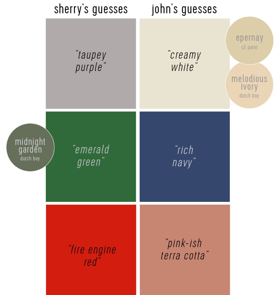
Glidden’s Warm Mahogony is like a darker version of the “terra cotta” I guessed. Almost like I got the hue right, but the value wrong. And obviously this isn’t terribly scientific… it’s mostly for fun & bragging rights in our house (Sherry & I have a friendly competion to see who can get more each year).
More Paint Colors We Love
You can check out more of our favorite go-to paint colors by touring our homes in the menu at the top of our blog. We’ve also written these detailed deep-dive posts about our favorite paint colors:
